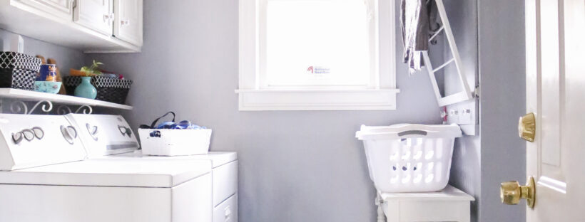
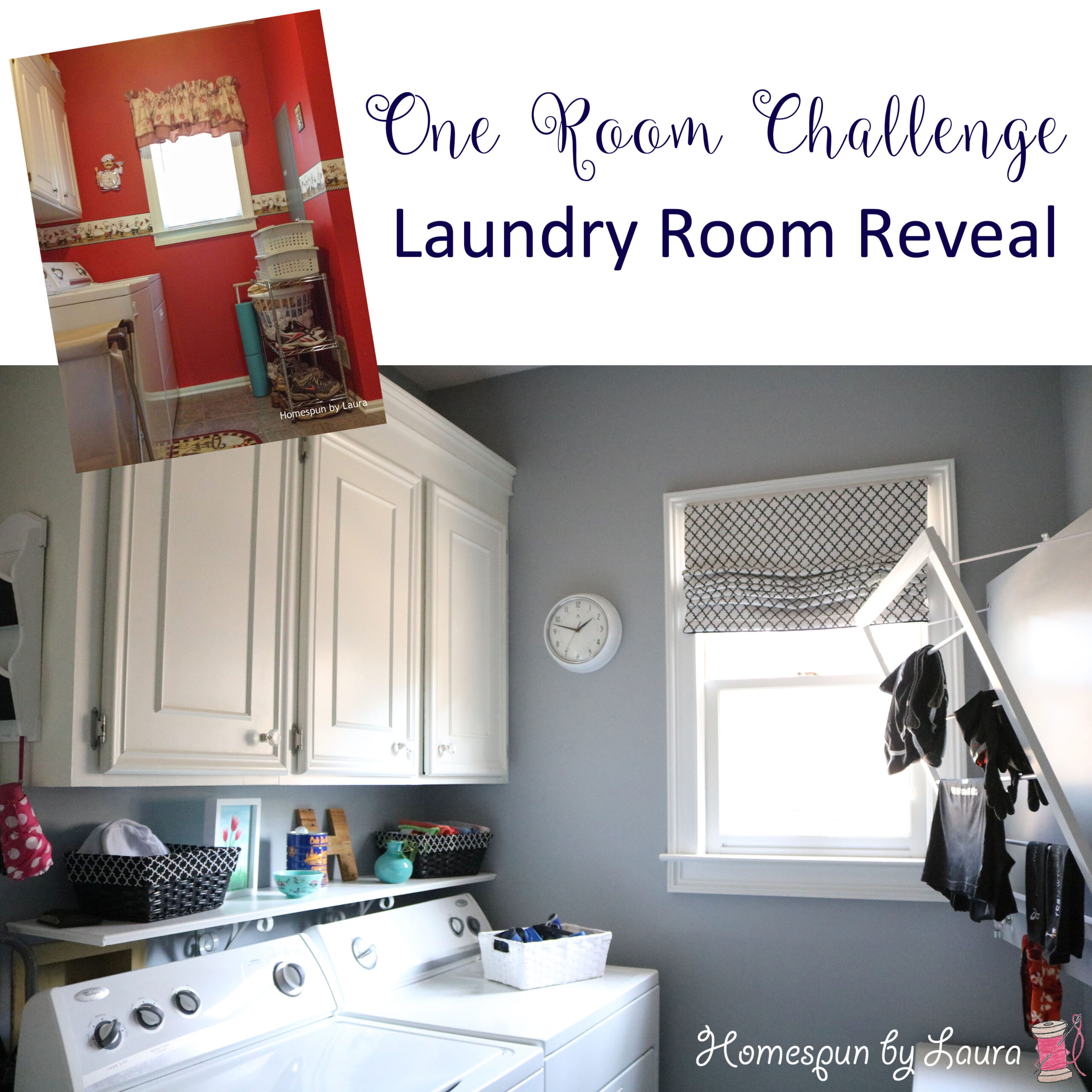
What was once a bright screaming red laundry/mud room became a calm, monochromatic space that welcomed us each time we arrived home.
It’s been about three months since the official end of the Fall 2016 One Room Challenge, and I’m finally sitting down to share my finished monochrome laundry/mud room with you!
If you’ve ever tried to decorate (and blog about) a room in five weeks while maintaining some semblance of a normal life, you understand why it’s called the One Room CHALLENGE. Throw in two weeks in Europe and a week in New York – oh, and running a marathon – and it’s even harder to complete the job in the specified time frame! But the job did eventually get done.
The Before
Here’s a reminder of what the room looked like when we moved in in 2009:
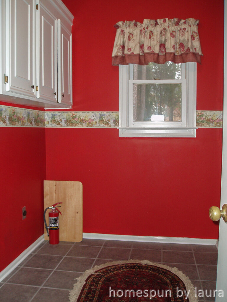
It’s the reddest laundry room you’ve ever seen!
I wanted to get rid of the red from the first time we walked through this house, but the idea of painting this room terrified me. To me, painting a small space is SO MUCH WORSE than painting a large space. They’re hard to move around in, and they still have all the cutting in, moving furniture around, etc. This tiny room has 8 corners, a window, four doors, and cabinets – and a washer and dryer! – to paint around. Definitely not a job for a novice; I had very little painting experience at the time.
The thought of hiring someone to do it for me was just as terrifying to me back then (because then I would have to pay them!), so I did the best I could at the time. I gave it the cheapest and easiest makeover I could come up with. That makeover consisted of covering the clashing floral wallpaper with dancing chef wallpaper, hanging a little chef clock, and adding some other chef-y items throughout the room.
You have to remember that this was approximately 2010. I was about 24 years old and Pinterest didn’t exist yet. And for whatever reason, I didn’t look through notebook full of pages I’d torn out of magazines for better ideas. 🙂
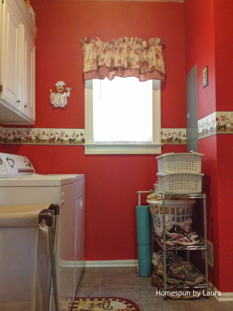
This little bakers rack might be ugly, but it stored our shoes and provided a surface for the laundry basket…and it goes with the kitchen-y chef theme, I guess.
It was a little weird for a laundry room, but I really liked those dancing chefs. They were a fix that matched my skill level at the time, and I still think they’re cute!

‘Phase 1″ Fixes
My goal in any room is always to improve the form, function, and feel of the space. But I had not yet identified these as goals at the time. Remember, I was young! While we could debate for a while about what I did with the look, the room did wind up being more functional long before I got to work on really improving its look and feel.
Over time, I added a few DIY projects that improved the function of the room, including my first Roman shade…
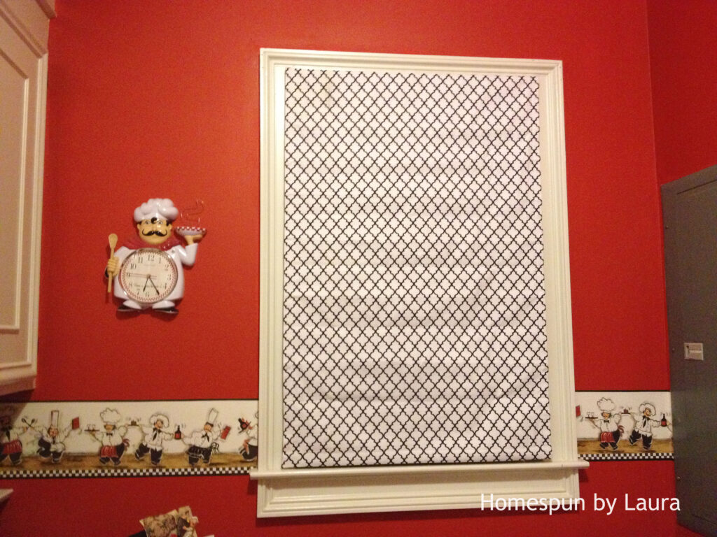
SO much better than that clashing floral valance!
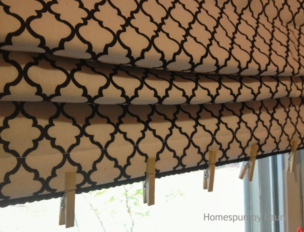
I glued the trim on after we hung the valance.
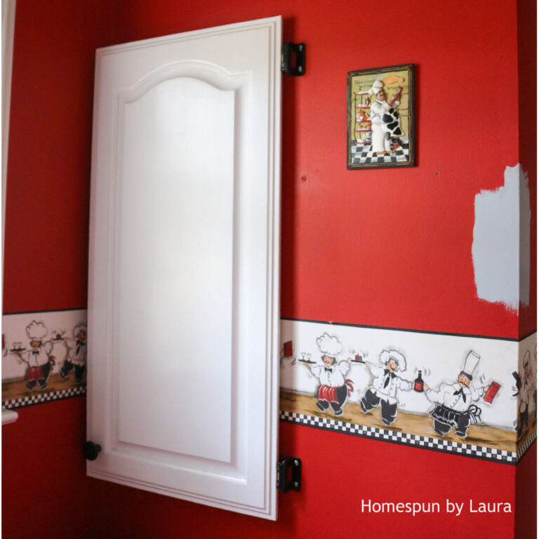
This $1 cabinet door from the Habitat store hid the fuse box. By this time, I think Pinterest existed. I don’t think I came up with this idea on my own.
A DIY shelf over the washing machine and dryer added surface area for a bunch of STUFF. By now I know Pinterest existed because I remember seeing a shelf over a washing machine back in the early days of it.
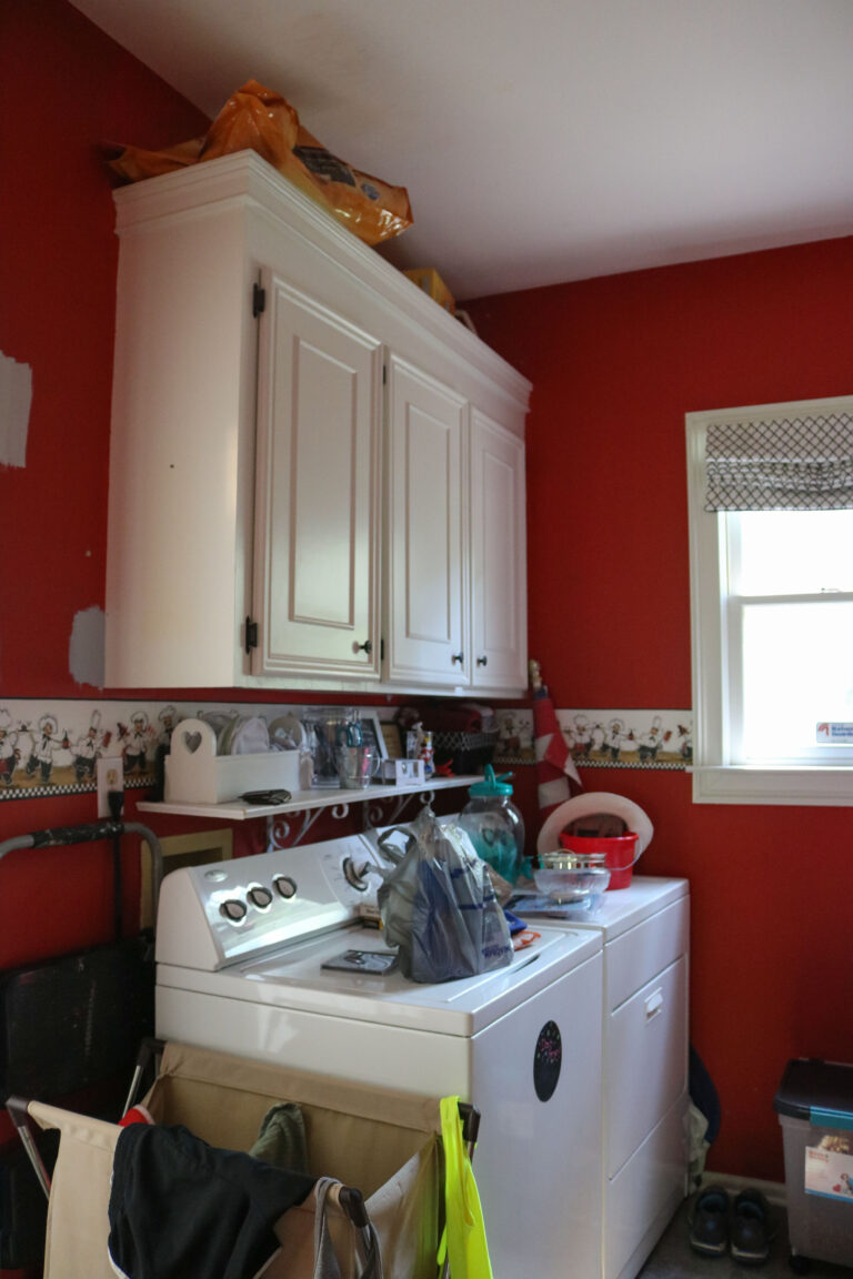
Well that’s a mess.
A rack on the wall provided a place to store the dogs’ leashes, potty bags, drying mitt, and travel water bowl…
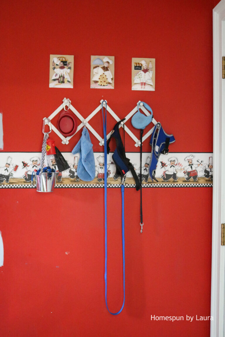
And even more chefs!
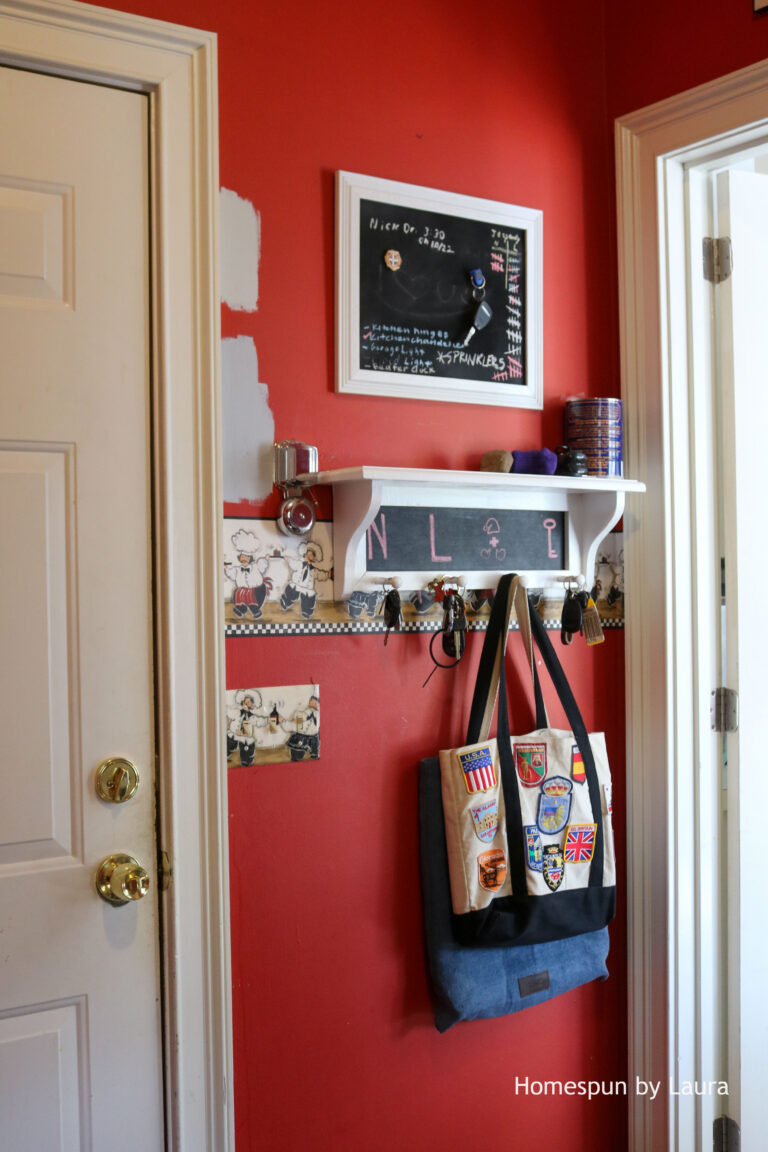
And finally, we used this DIY chalkboard to write reminders and keep track of our Jeopardy scores (I won a lot!). A shelf with pegs held our car keys and whatever else needed to be off the floor but easy to grab on the way out.
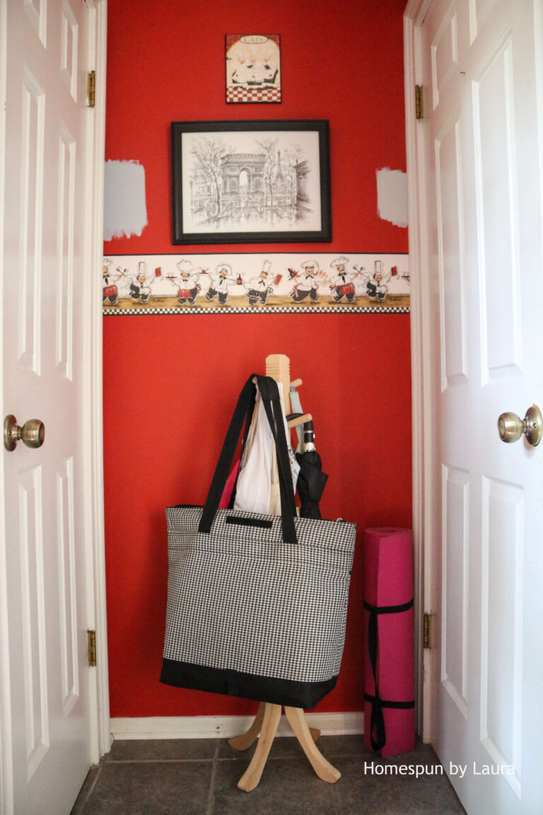
At some point, the French chef theme went a step further. This drawing of the Arc d’Triomphe I got on a trip to France in 2005 found its way on to the wall.
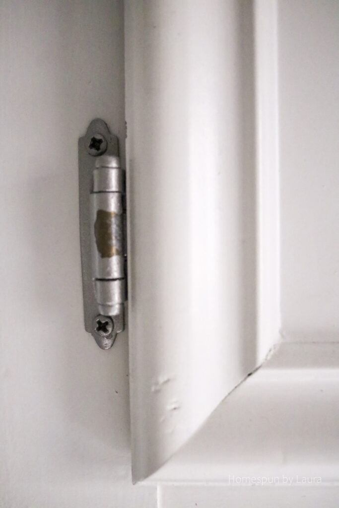
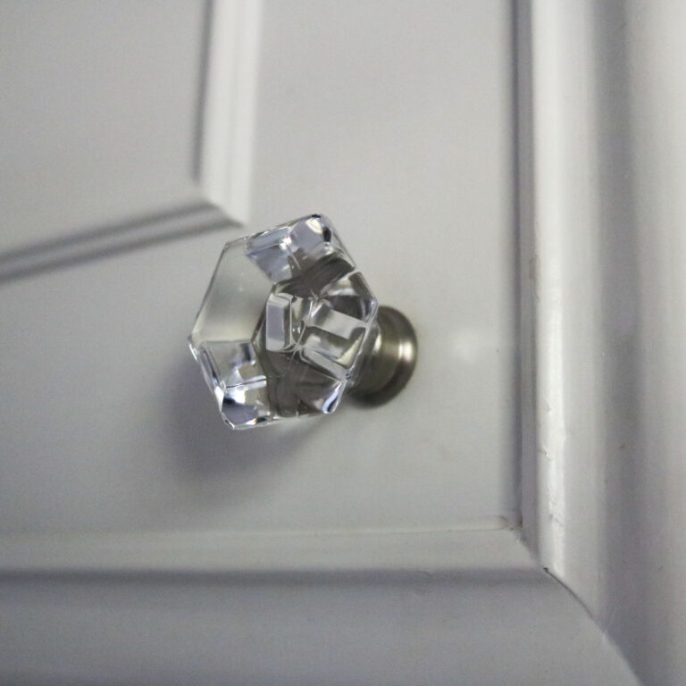
Over the years, the hinges and knobs went from bronze to white to black to silver. Eventually, the original knobs took a long-overdue trip to the Habitat store. You’ll see the pretty, shiny ones I replaced them with in a minute…
I’m including this photo of one of the spray-painted hinges not long before we moved out to show what years of use does to this (free!) upgrade. A set of hinges isn’t that expensive, but if you’re looking at a lot of cabinets, the cost ads up. I think for a free change, this isn’t too bad.
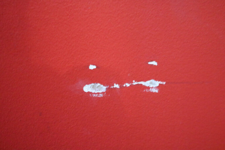
By the time I began to formulate a real plan for this room, it was in sad shape, from the clutter that had accumulated in it to the scratches and dings on the wall, many of which were already there when we moved in.
The band-aid that was the bright red chef-y laundry room was more like a scab you just wanted to pick. But I left it this way for…years.
Now that you know how bad it was, let’s talk about what it took to transform it.
A time for change!
After living with this bright red laundry room for 7 years, I finally shifted my focus back to it and made the half-vision that was in my head into reality. I had a lot more DIY experience under my belt, and I felt more able to make changes.
I wanted to warm it up by cooling it down. By painting the walls a bluish-gray, I could keep the black and white accents for a monochomatic look.
Adios, red walls.
When I finally got up the nerve to take down the wallpaper border, it turned out to be a pretty easy process. I was even able to return the wallpaper removal tools I bought because I didn’t need them!
The chefs came of easily and pulled some of the garden border off with them.
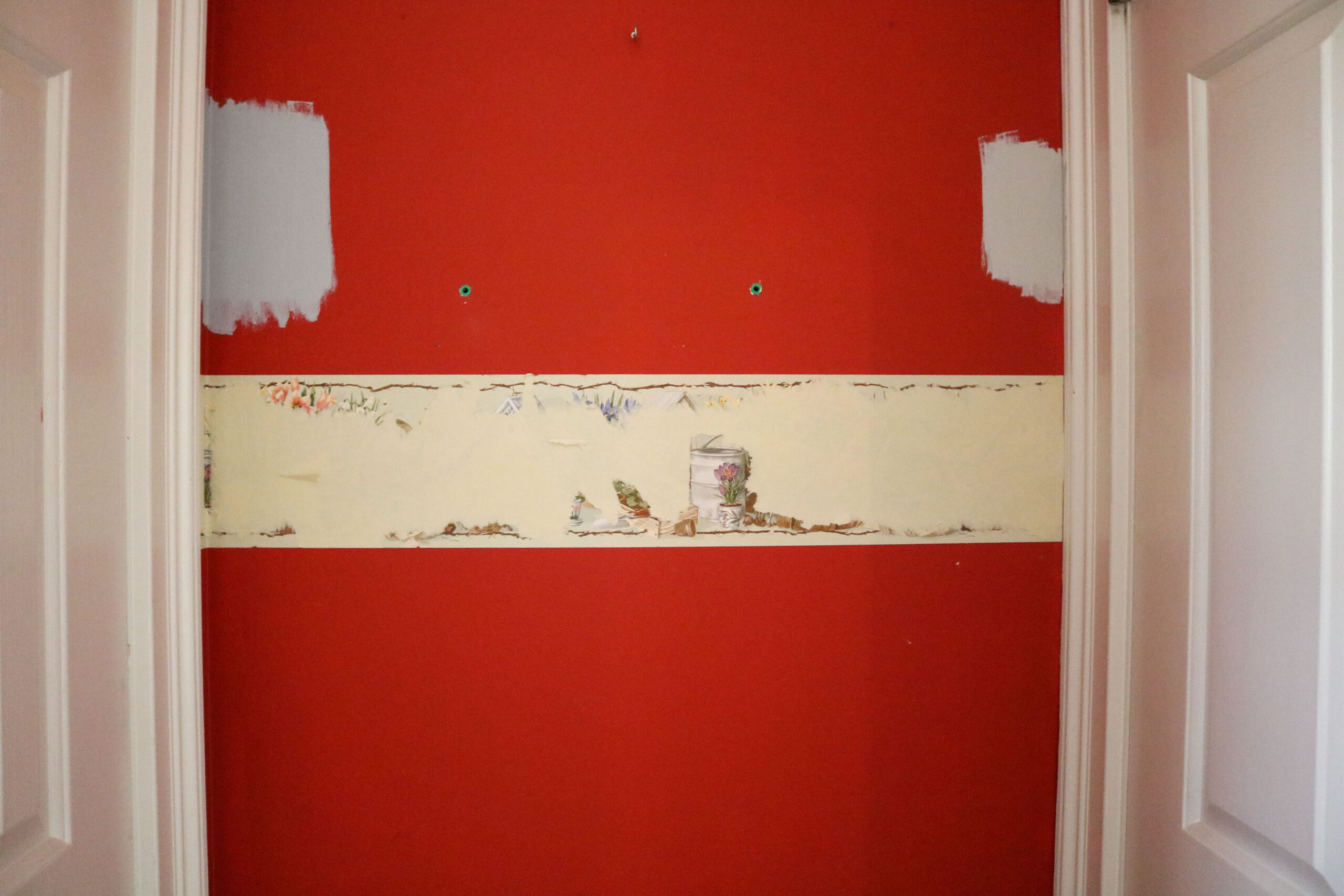
Then all it took was some water in a spray bottle…
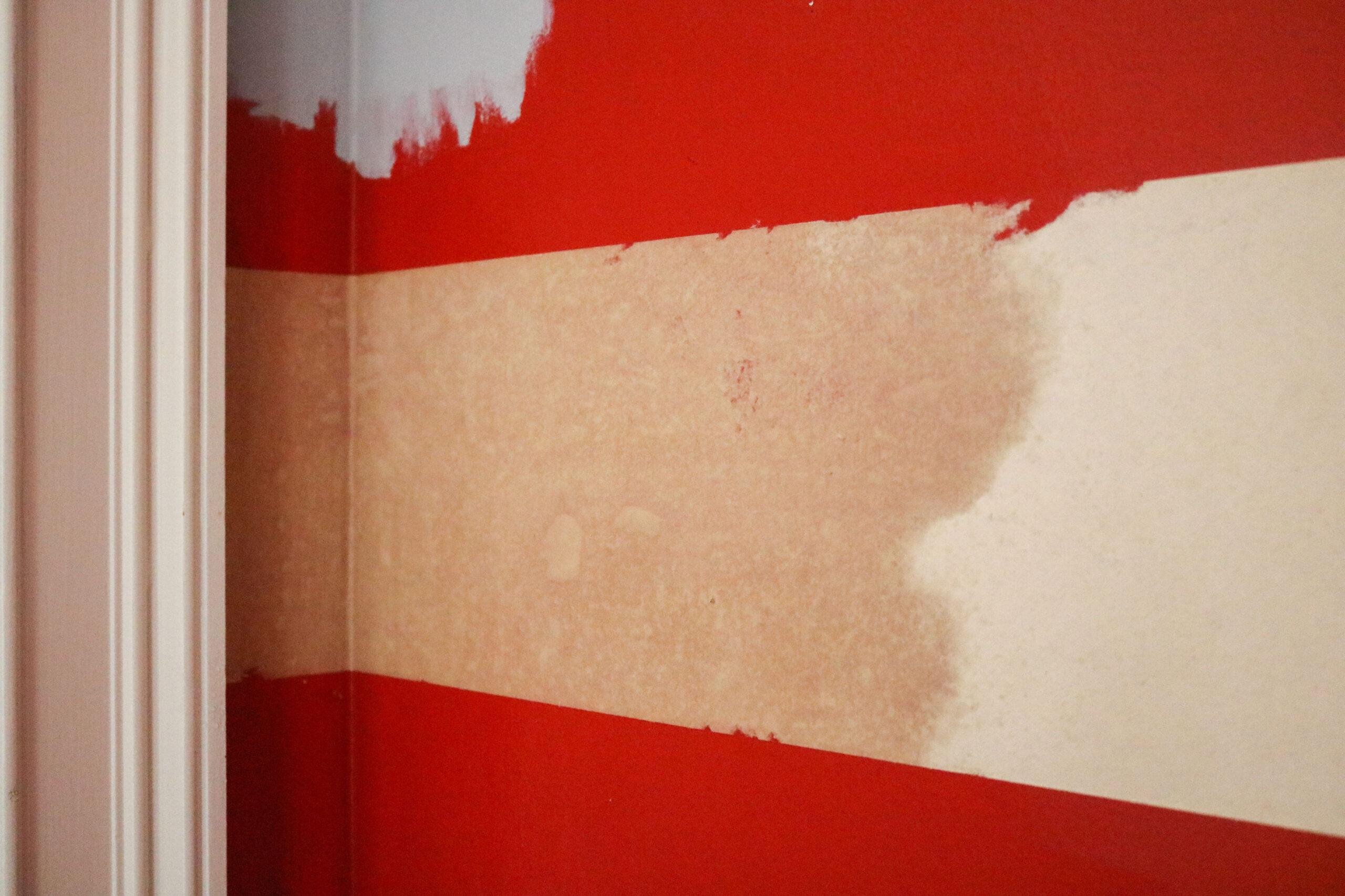
…a putty knife…
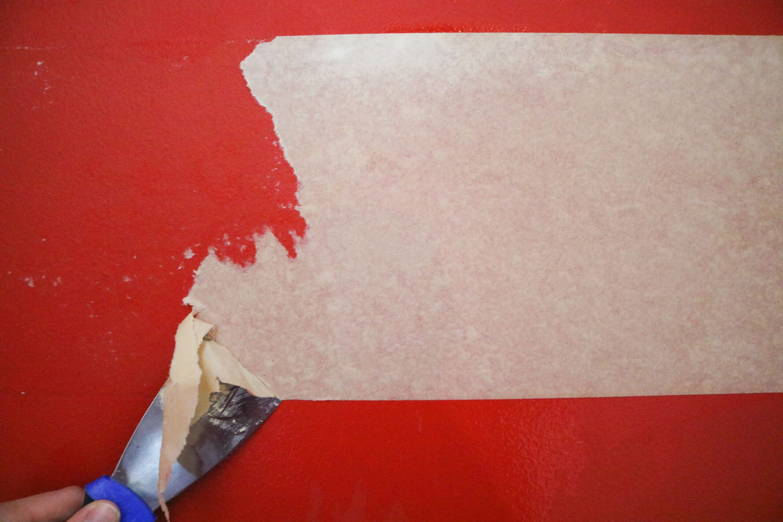
…some tugging…
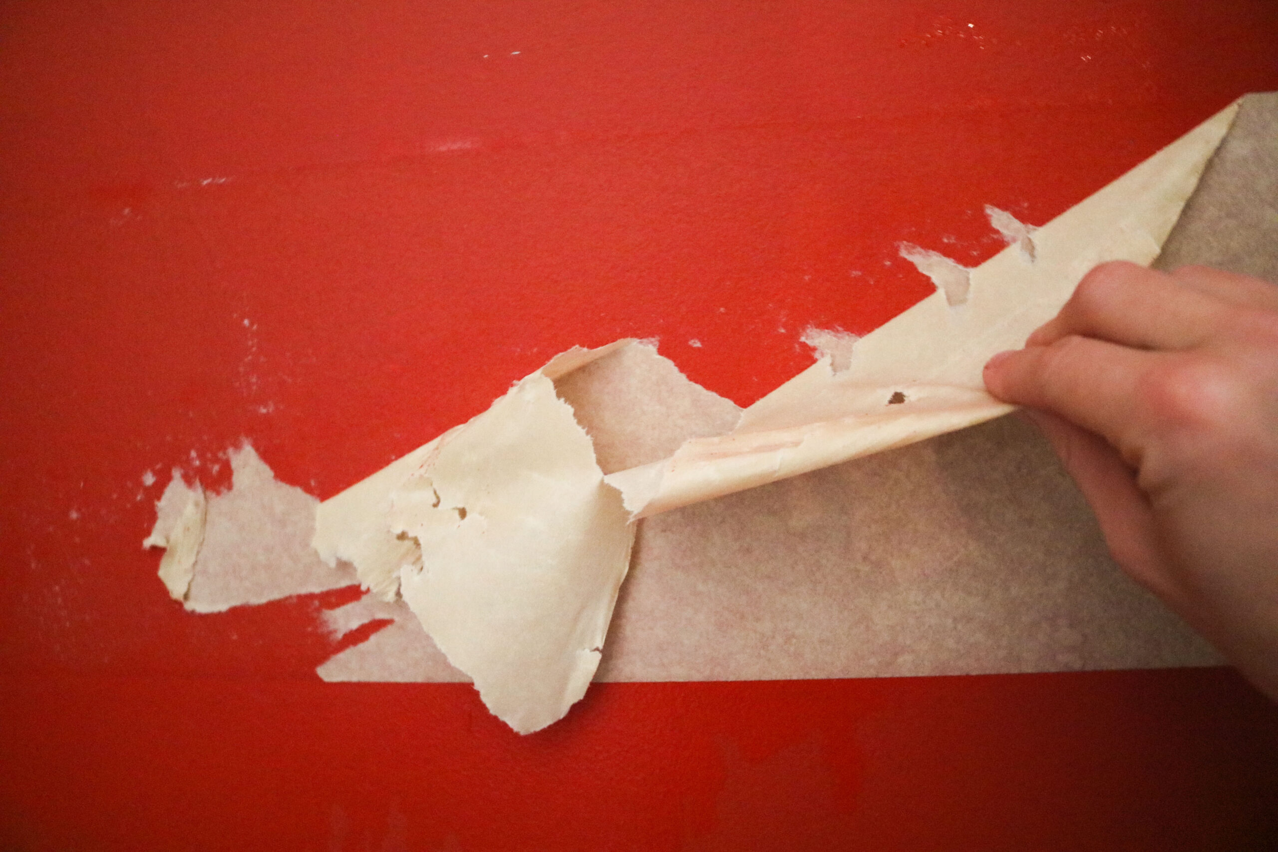
…a sponge to wipe off the residue…

…and a broom.
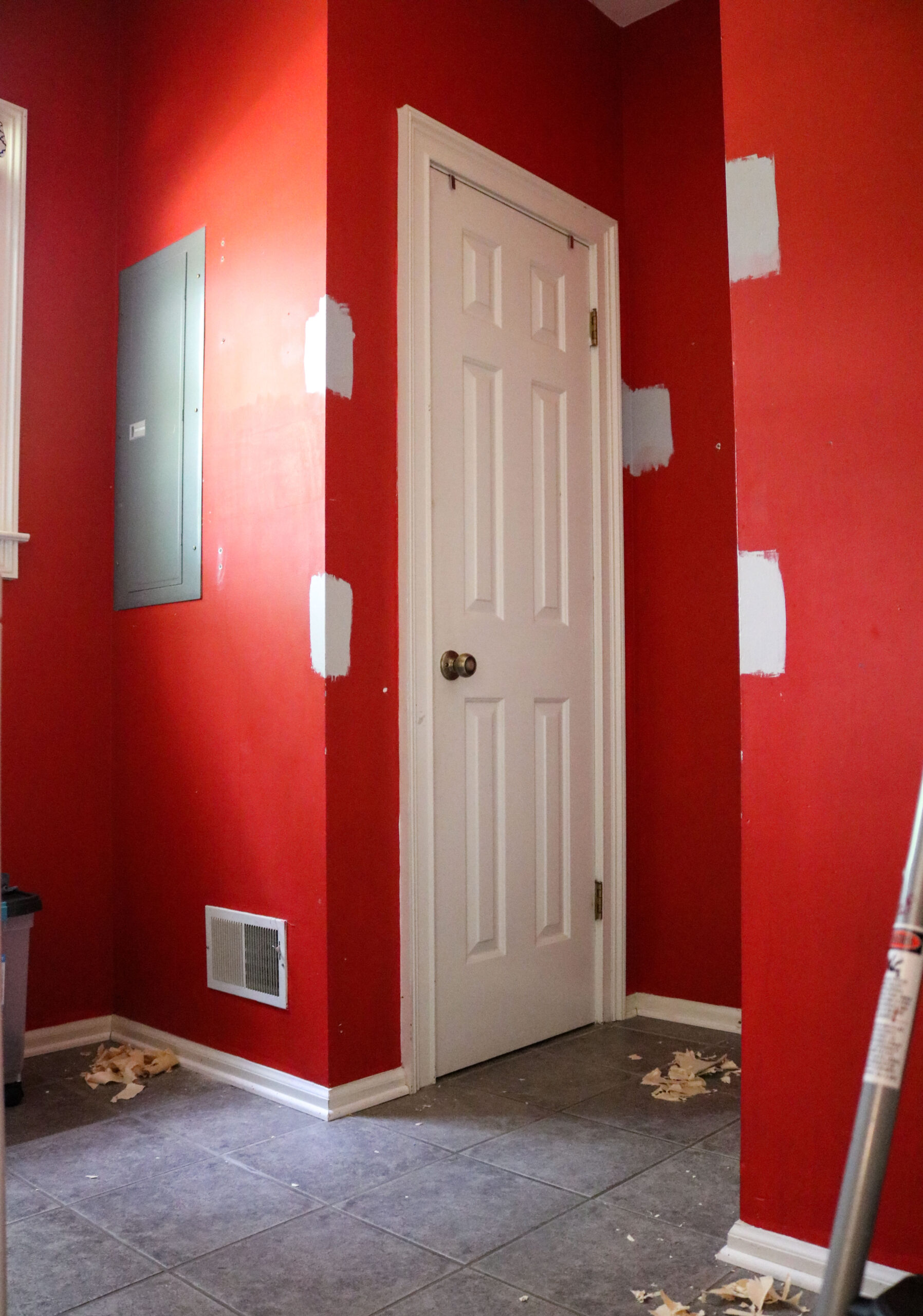
We did hire a painter to paint the room, and I don’t regret that decision at all. This would not have been a fun room to paint, shifting around the washer and dryer in the limited floor space to do it! The cabinet paint was in pretty good condition, so I saved some money by just cleaning the them REALLY well and switching out the knobs.
The Final Reveal
So, without further delay, here’s what the monochrome laundry room looked like by the time we moved out!
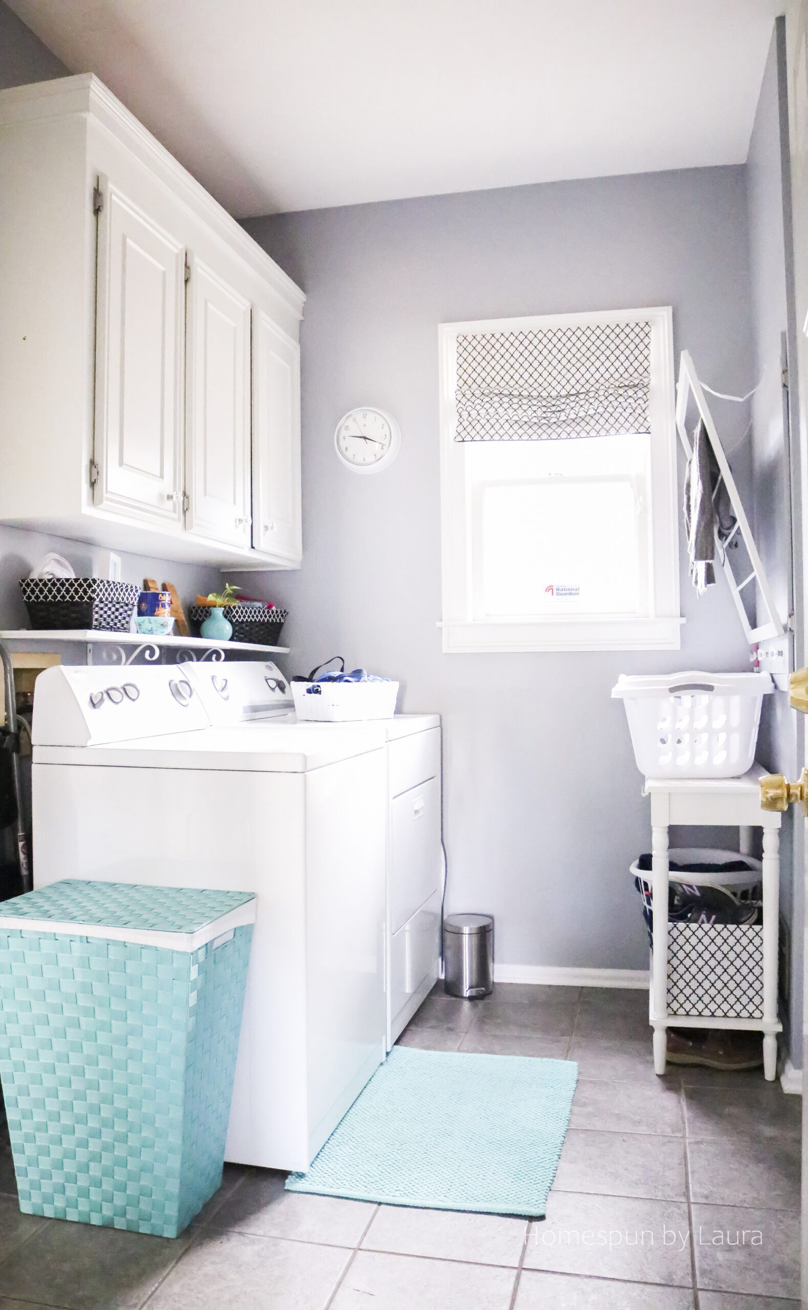
The cool colors gave us a warm hug each time we came home.
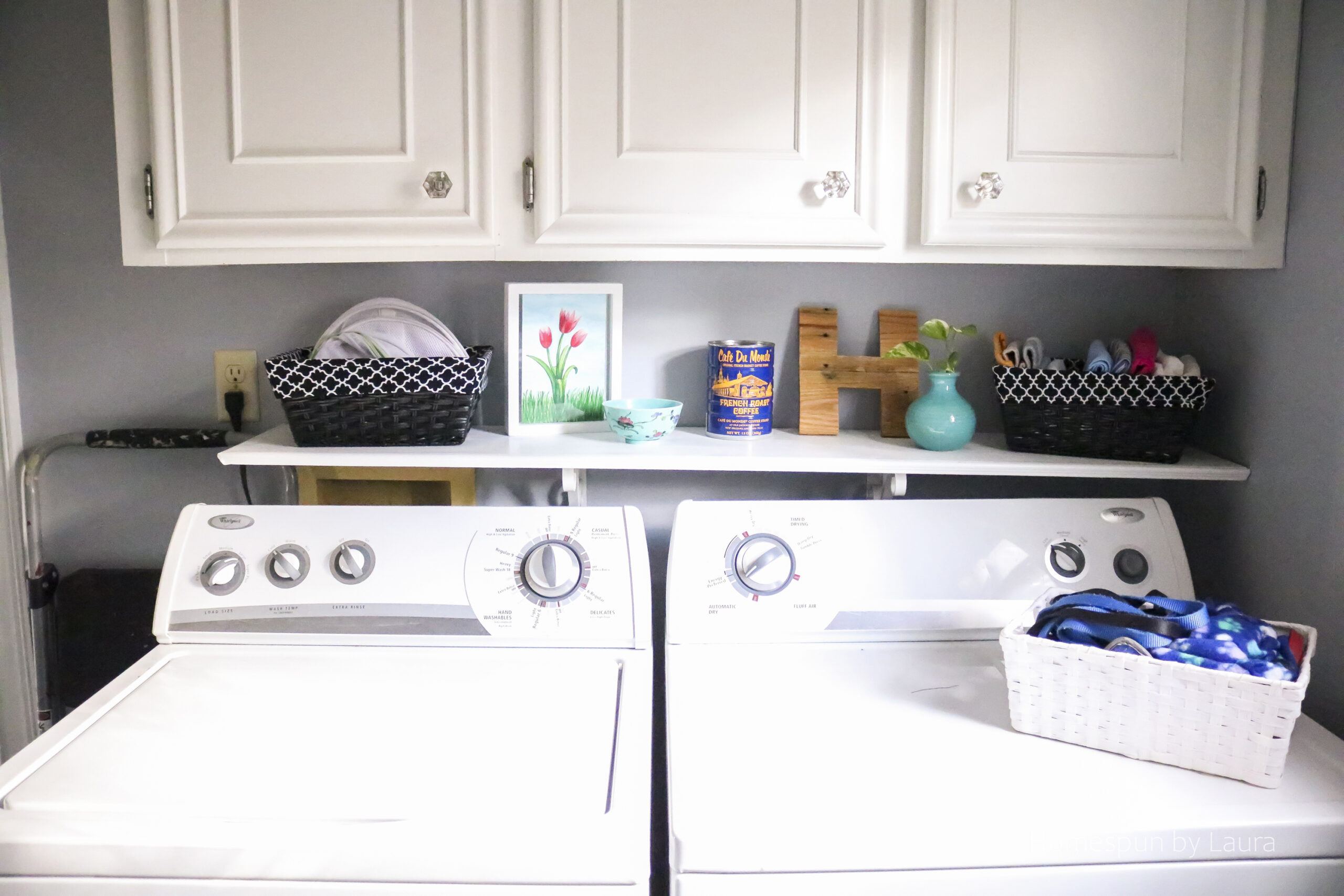
I replaced the metal bakers rack with a cute console table (if you’re in the market, this table is similar), added pops of pale teal, and a pretty white clock (that doesn’t tick!). I was able to reuse the black and white baskets and liners I’d made years before for the red laundry room to keep delicates bags, cleaning rags, and tennis shoes within reach.
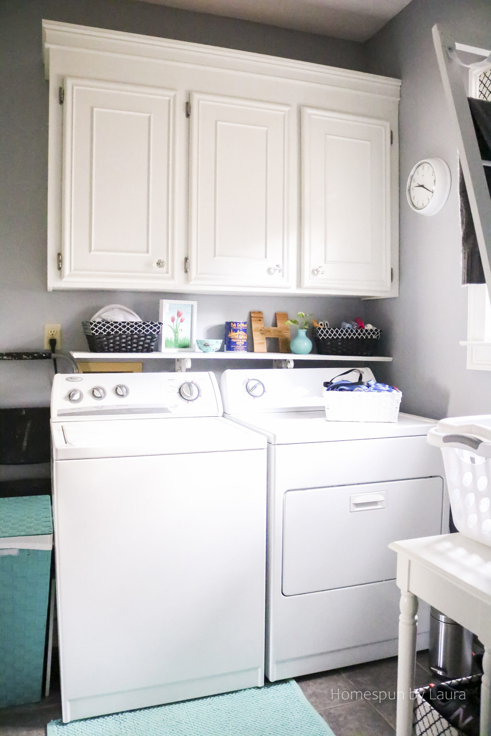
The little plant and wooden letter add some warmth.
The iron and ironing board got a new home that was easily accessible, whether I needed them for laundry or for sewing purposes upstairs in the nearby office.
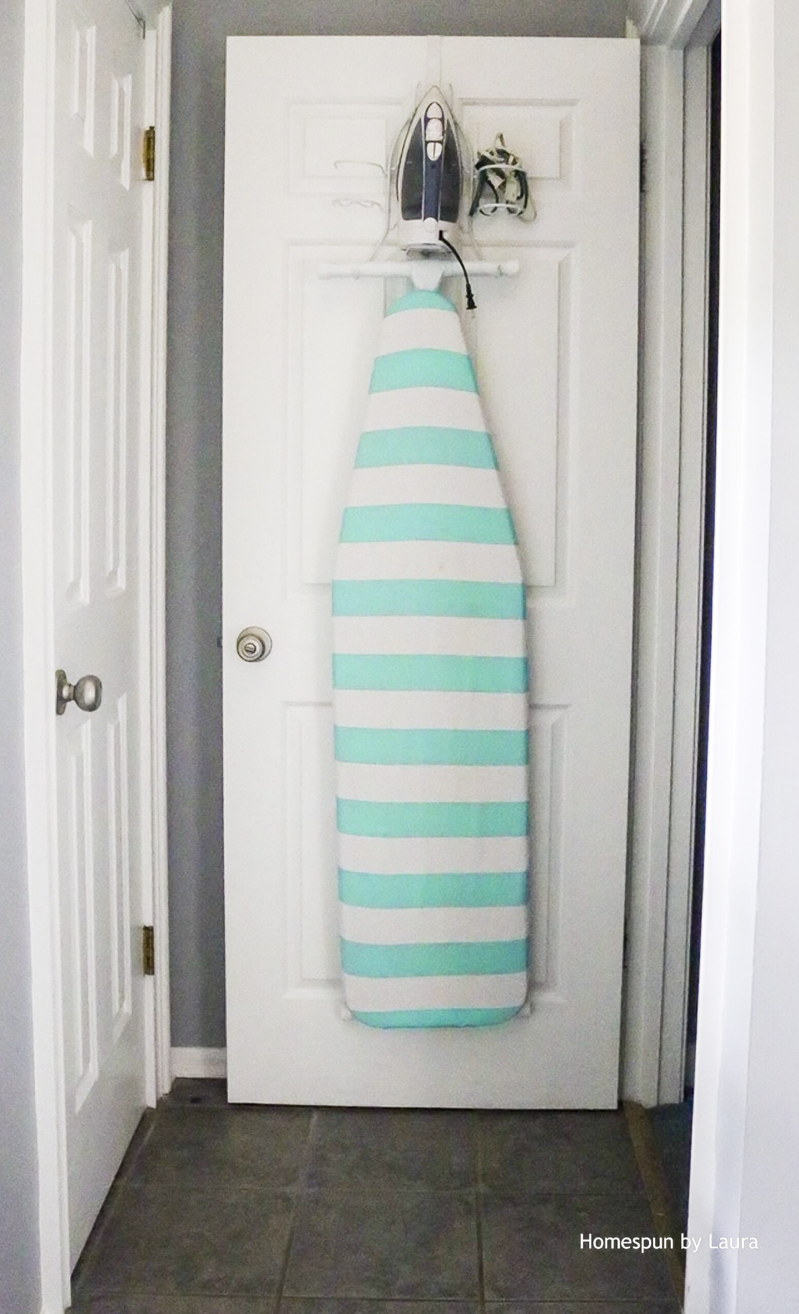
This was a much better view while I sorted laundry:
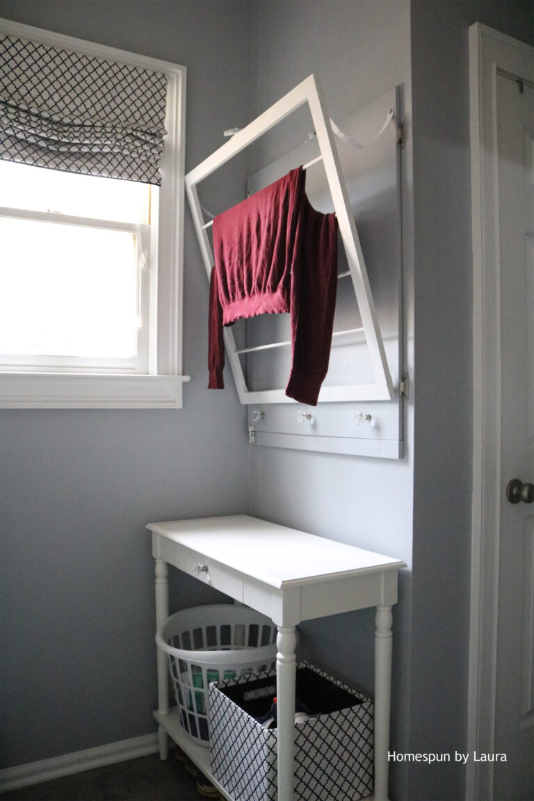
The DIY Drying Rack
I shared more details about the Never-Ending DIY Project, or the DIY Laundry Drying Rack and Fuse Box Cover here. It certainly looks nicer than the cabinet door did and provides an actual function.
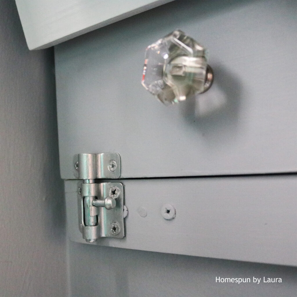
This latch pops open to let the ‘door’ swing forward for access to the fuse box.
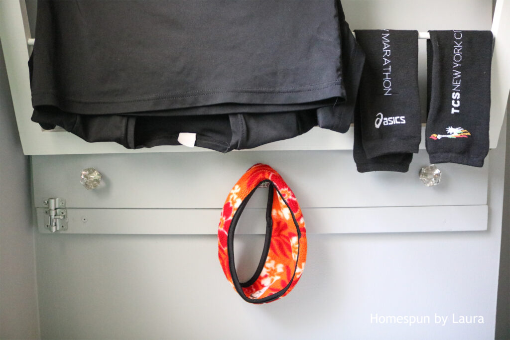
The drying rack was so handy to drop all my wet running clothes on my way back inside every morning.
Art
The walls next to the door got some new art. Both items came home with us from Monet’s home at Giverny, which we visited while in France during the One Room Challenge (I even posted one of my ORC updates while we were there!).
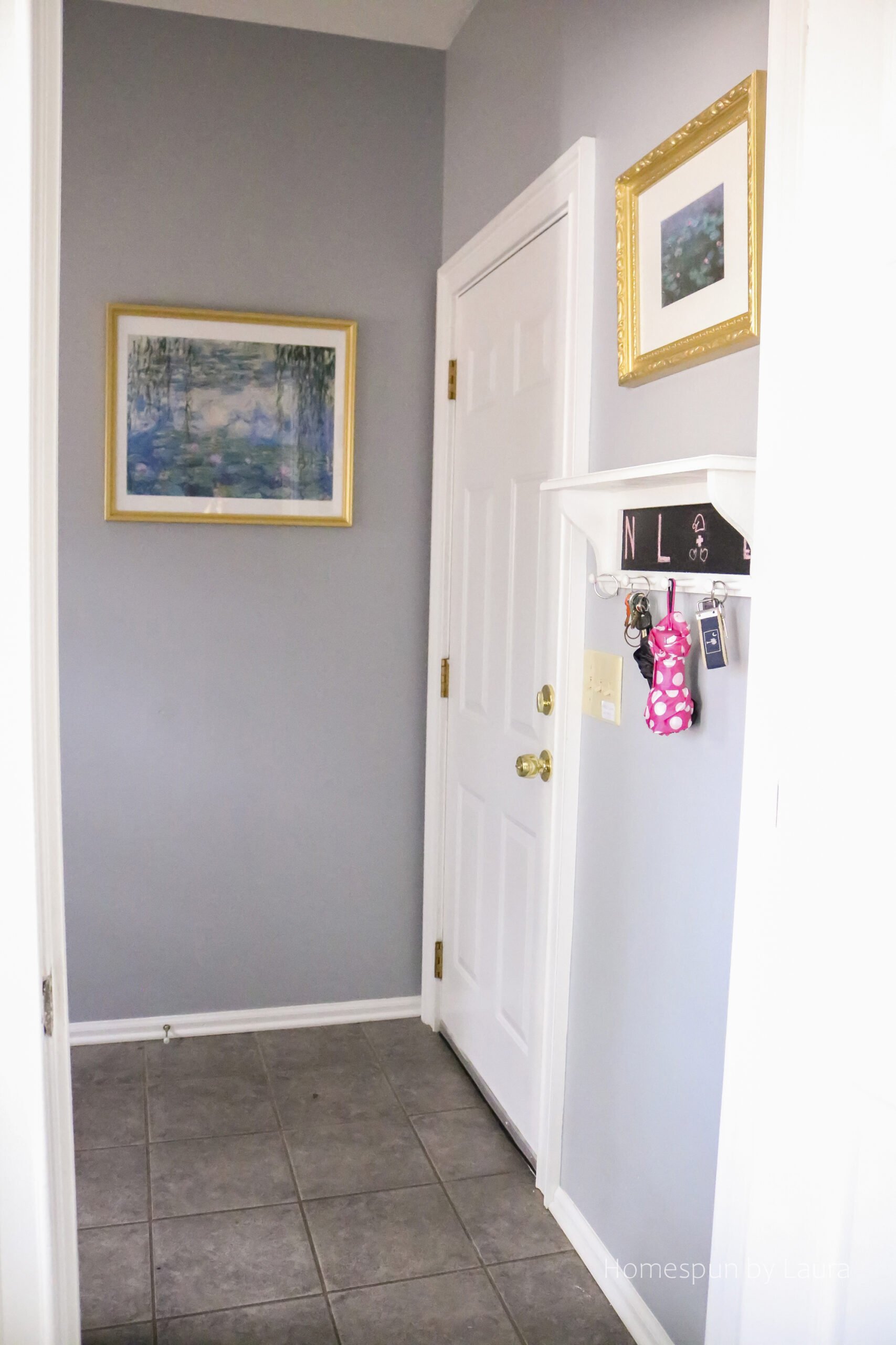
I was a little nerdy and left notes on a few confusing light switches so the new owners wouldn’t have to figure them out by trial and error like we did. The really strange thing is that I took these photos several weeks before we moved, so we lived with those notes for a while, too.
The smaller, more ornate frame was originally white. I couldn’t find what I was looking for in gold, so I gave it a makeover, starting with a coat of spray paint and finishing it off with a few layers of gold leaf.
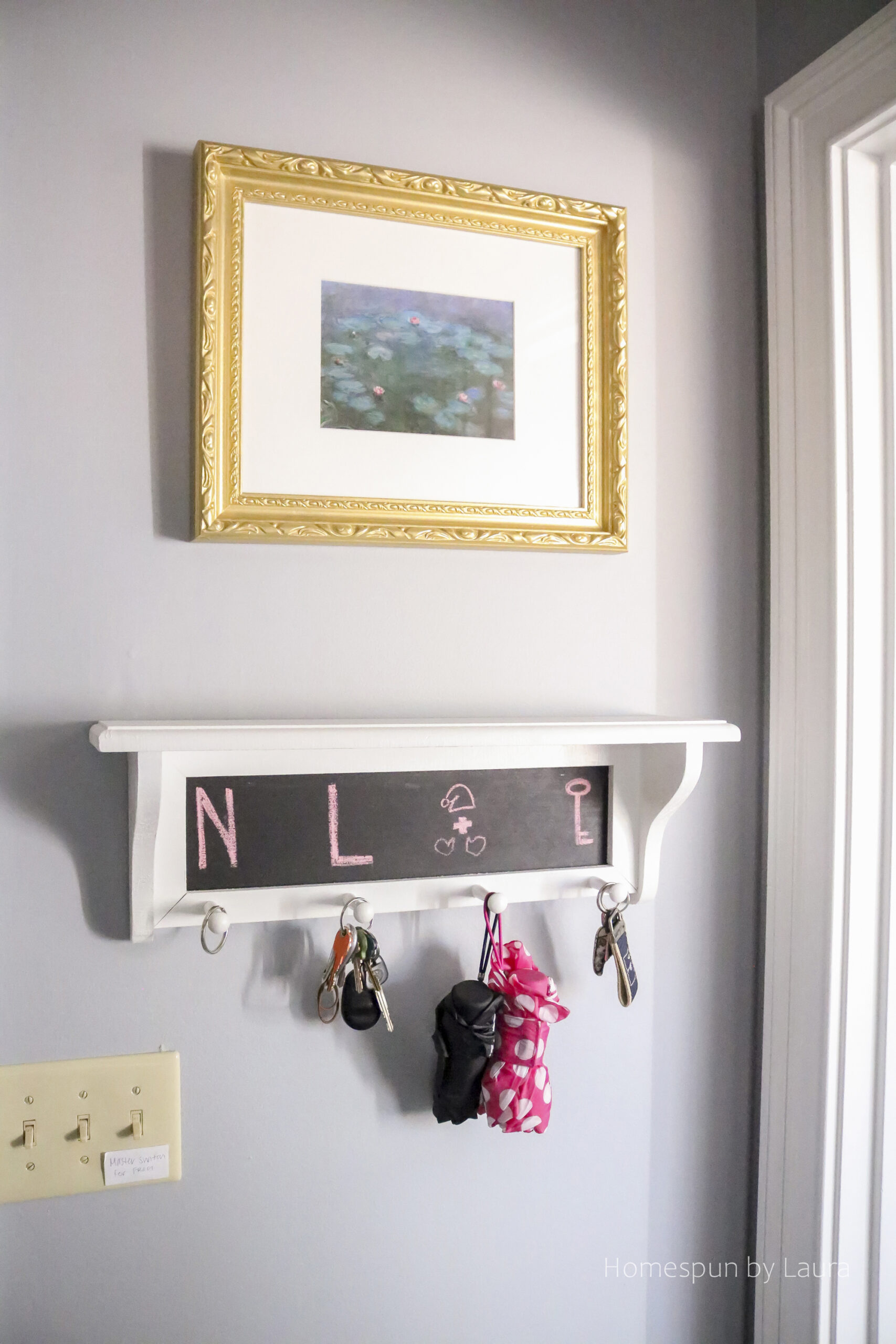
The larger frame came from my aunt and had a few red spots on it, so I used the same gold leaf to coat the entire frame to wind up with two coordinating frames. One container was not enough, and Hobby Lobby was out of the color I needed, which meant I had to special order it…adding more time to my already delayed One Room Challenge reveal.
I’m not 100% pleased with the skinny mat I had cut for the poster print in order to keep Monet’s signature visible, but it was the only way to make the art and frame I had work together.
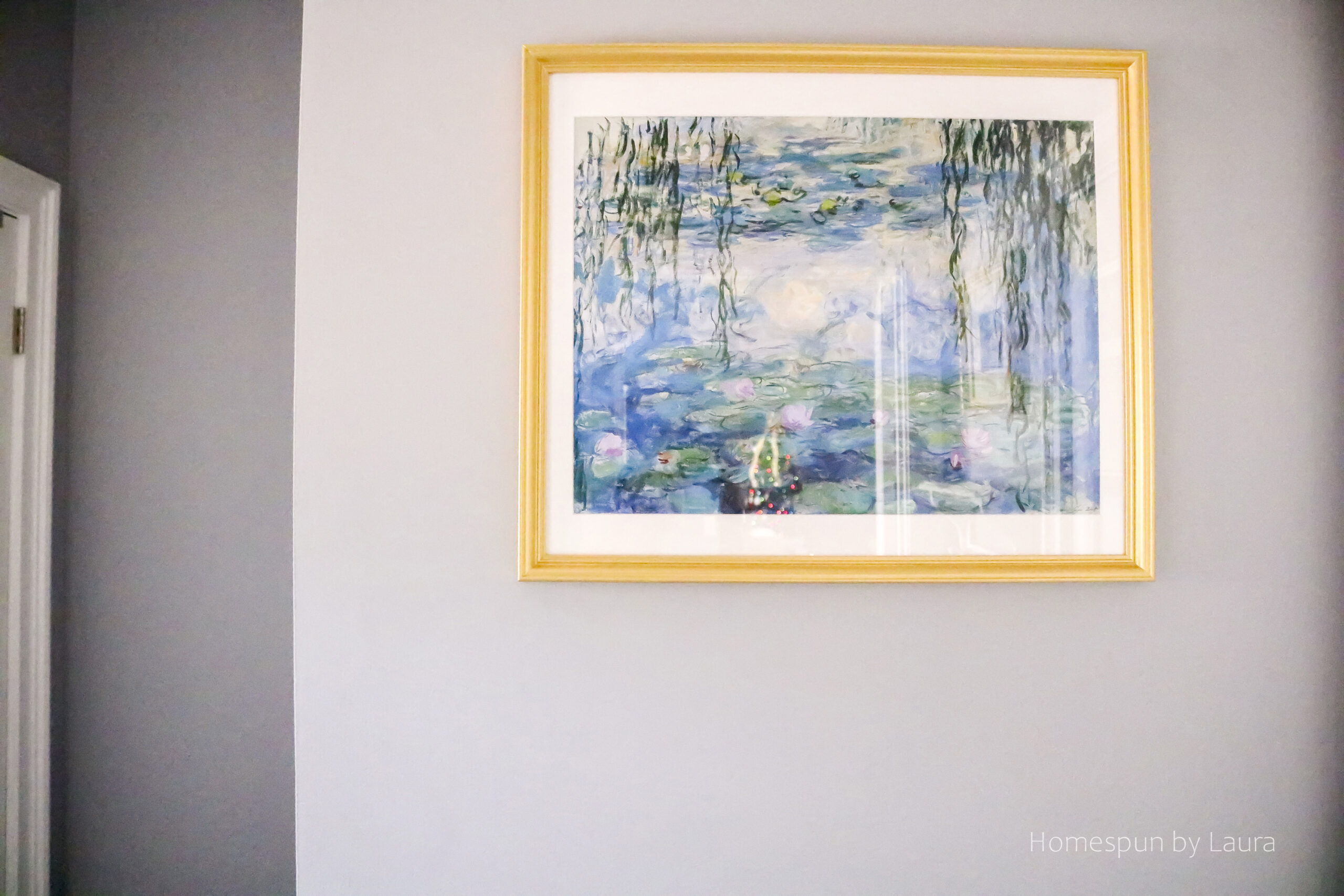
You never knew Monet painted a Christmas tree into the Water Lillies, did you? Just kidding. It’s the reflection of our tree in the other room. 🙂
There’s quite a story behind this print – it had a transatlantic travel adventure originating with the French postal service in the Orly airport, continuing with a visit to US customs somewhere in NYC before it found its way to South Carolina several weeks later and onto this wall. I wasn’t permitted to take it on the plane with me as its tube apparently took me over the carry-on item limit, so I used the last of my Euros to pay for it to be shipped back home, leaving me with under 1 Euro in change to bring home with me. Three weeks later, it showed up on our porch.
These nontraditional souvenirs are a fun reminder of our trip every time I walk through the laundry room.
Light
The one thing that might not have changed is this awful light (I’m updating this post two years after we moved out and just can’t remember!). I couldn’t find anything that I loved enough to pay for within the ORC time frame (or the ORC time frame + 14 weeks) so it stayed put at the time.
But at some point later, I seem to remember a loud crash coming from this room. I don’t recall whether the Mister was changing a lightbulb and dropped one, or if was perhaps this lovely glass shade. I do remember getting a broom and garbage bag and shooing the dogs away.
Since I didn’t take any photos of this fixture before we moved, I’m afraid I can’t say for sure whether we changed it or not. If we did, all we did was buy another glass shade to replace this one without changing out the actual fixture. It’s a mystery.
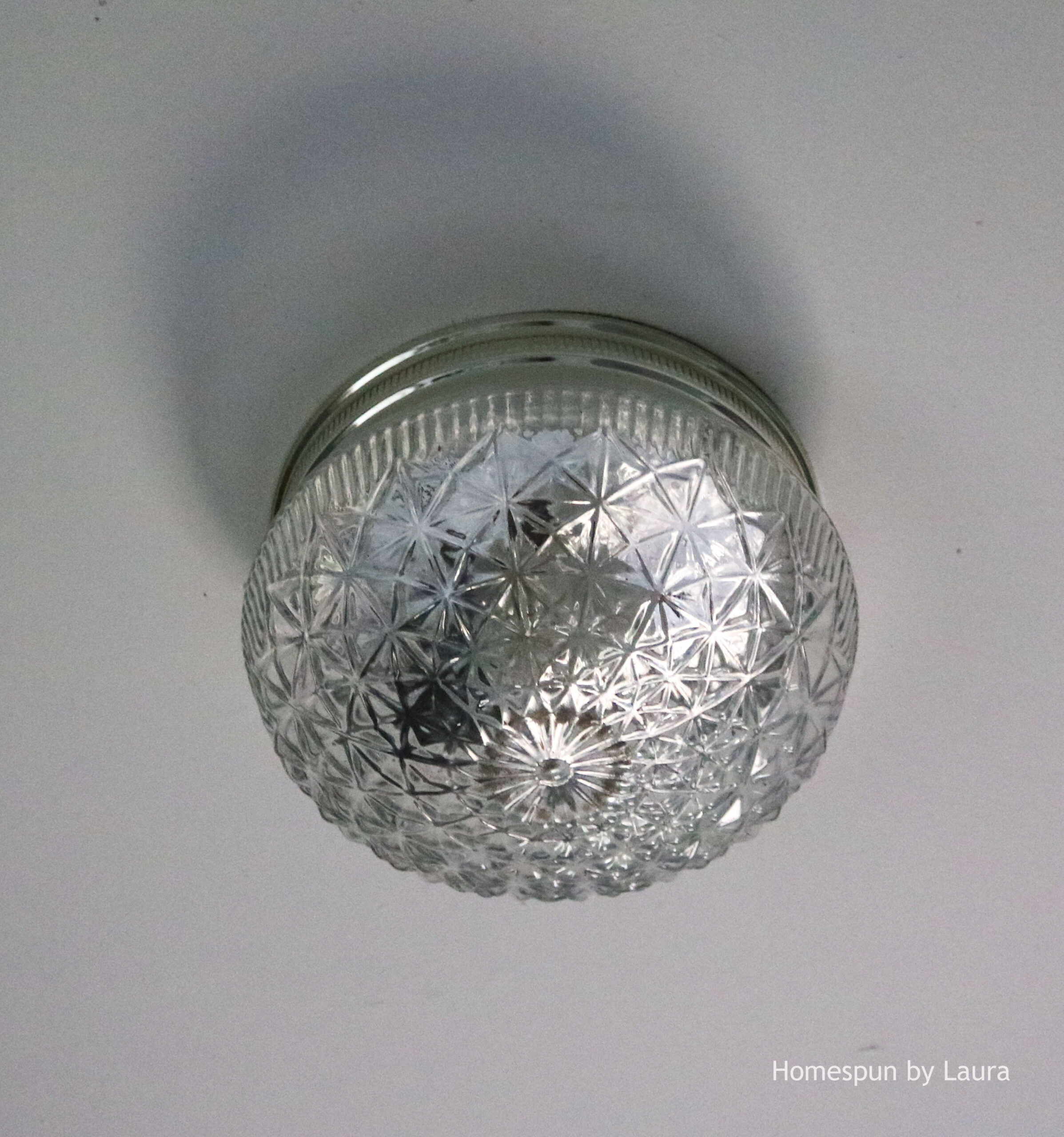
That was an anticlimactic paragraph. Sorry.
Budget
When I started the monochrome laundry room project, I didn’t have a set budget in mind, but I wanted to keep the cost as low as possible while still ending up with a great result.
I’m usually pretty specific about the budget, but there was a lot going on at the time. I either didn’t set one or misplaced the scrap of paper where I recorded it!
Here’s what I remember: With the exception of the labor for the painters (and the postage to mail Monet!), this entire room came in around or under $275, including the lumber for the drying rack, the new white table (which was around a third of the total budget), cabinet knobs, paint (which we supplied), new ironing board cover, picture frames, gold leaf, etc.
Finishing…
The great thing about the 5-week time frame of the One Room Challenge is accountability (those six posts occur over a period of five weeks!). Once those five weeks pass, though…it’s hard to get back around to finishing the project! I’d walk through the laundry room each day as I arrived home or headed upstairs to the office. I’d think about finally touching up the paint, or going out to buy the second container of gold leaf, or taking the ‘After’ photos, and I’d say, “Well, when it’s been this long, what’s another day?” or “The light’s not great for photos right now.” And then I stopped blogging altogether for a while…
I’m glad my Fall ORC project is finally complete – over three months later – and I look forward to perhaps participating again, hopefully within the set time period!
You can read about how we made the Never Ending DIY Project Fuse Box Cover/Laundry Drying Rack here. Or check out the recaps from weeks 1-6 of the One Room Challenge here.
If you want to see what else I’ve been up to in the past 14 weeks while neglecting this blog, head over to our travel blog, 48 No Interstate, where we’re sharing experiences and travel tips from 2016’s 80-day long cross-country back roads road trip to all 48 continental states!
Thank you for your pins, shares, tweets, and likes!
Monochrome Laundry Room
